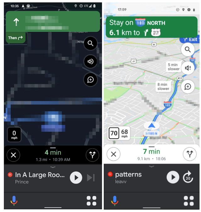
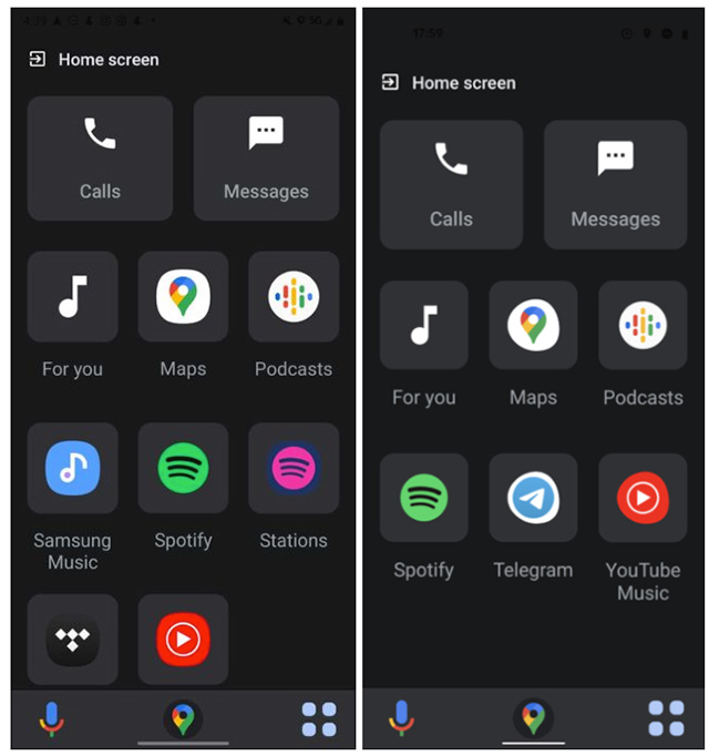
The new UI looks quite similar to what you’ll find if you use the Android Auto app on your smartphone. However, Android Auto itself is expected to be replaced by the Assistant Driving Mode, so why add a similar UI to Maps? See why I’m confused? Image courtesy: Android Police Anyway, speaking of the UI itself, it brings in large buttons on the bottom for launching the voice assistant and for what can be described as an app screen with compatible apps. According to screenshots shared by Android Police, this screen contains apps you are likely to need access to while driving. So you’ll get music players, podcast apps, messages, and calls. Image courtesy: Android Police On the other hand, the Voice Assistant button will do exactly what you’d expect it to — launch the Google Assistant so you can control your phone with your voice. Other than that, the rest of the navigation UI looks pretty much the same as it already is. Once you tap into the app screen from the large buttons on the bottom, you will also see a third, new button in the bottom navigation bar. This one is simply the Maps icon, and will take you back to the navigation screen without having to fiddle with back buttons and gestures. The redesign is apparently a server side switch that’s rolled out to a small group of users right now. There’s no word on when (or if) Google will roll it out widely. Featured image: Android Police

